How to Make a Bar Graph in Excel

Transforming data from a boring spreadsheet to a visually appealing bar graph is easy in Excel. Here’s how.
Using graphs and other visualisations in Excel allows you to easily determine the results from your data set. A bar graph, for example, makes it easier for readers of a spreadsheet or viewers of a presentation to break down the data more efficiently.
We’re going to create a basic bar graph for this article, but there are other ways to visually represent data like Pie Charts, Line Charts, and Radar Charts.
If you haven’t created a chart or graph in Excel before, starting with a bar graph is easy to get started. This article will show you how to create a bar graph in Excel and add some customizations.
How to Make a Bar Graph in Excel
To start creating your first bar graph in Excel, do the following:
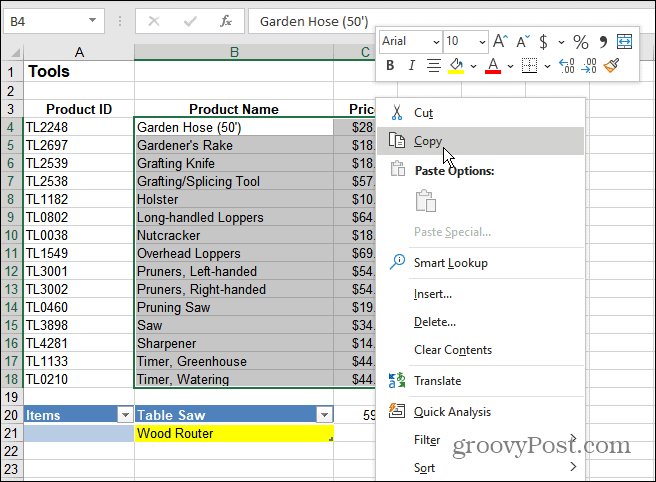
- Select the data you want to use for the bar graph and copy it to your clipboard.
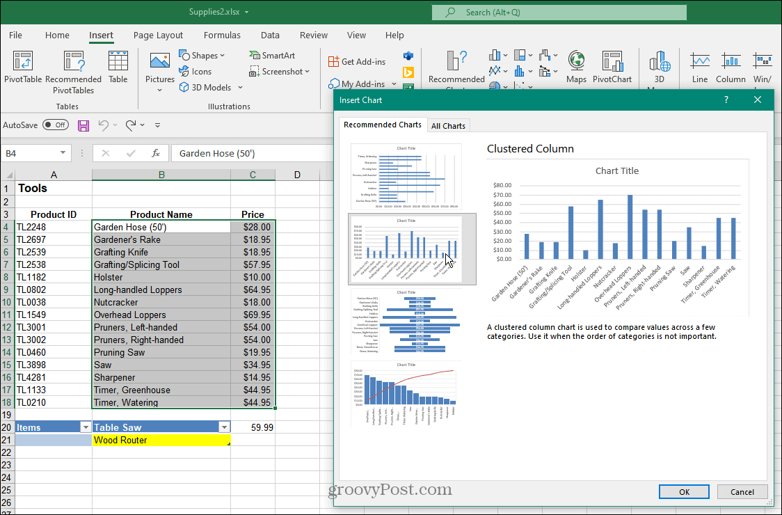
- Click the Insert tab and click Recommended Charts from the ribbon. Choose from the basic Clustered Column bar charts and click OK.
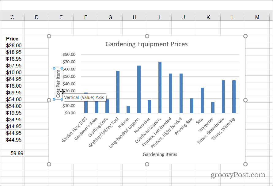
- Excel will place the bar chart with the data you copied to the clipboard on your worksheet. Once you have the chart, you can resize it, move it on the sheet, or copy it to a different workbook.
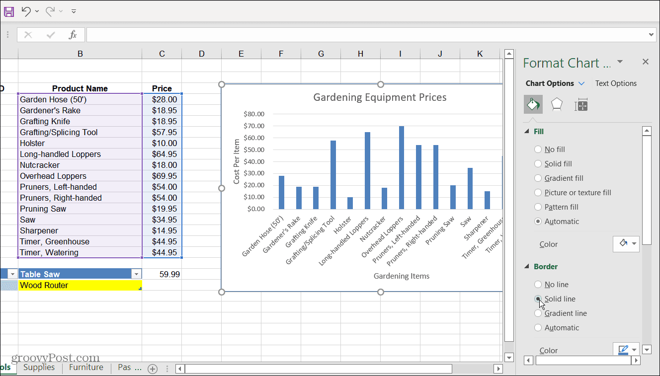
- The graph in this example shows gardening tools and their price.
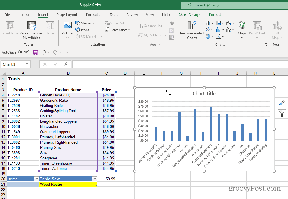
- You can change the graph’s title by double-clicking it and typing in a new name.
- You can also eliminate the title field entirely if you don’t want it. To do this, click the green Chart Elements + button, then uncheck the Chart Title option.

6. You can add or remove several different things from the Chart Elements menu. To do this, click the Chart Elements button to add or remove Axis titles, Data Labels, Gridlines, and more.
7. Open the Chart Elements menu and hover your mouse over each item to get a preview of how it will look on your chart.
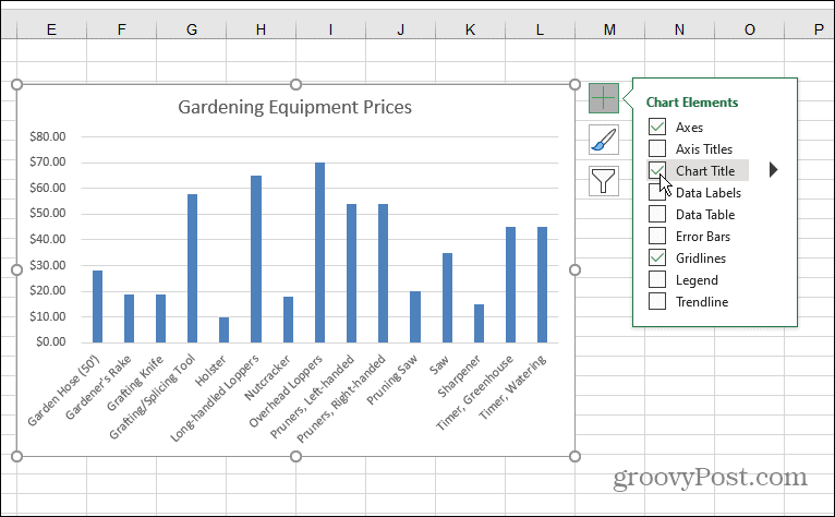
8. After you add an element, you can continue to customize them. For example, the Axis option adds an X and Y label for the chart.

9. Just like with the title of the graph itself, you can double-click elements and type in a new name.
Add whichever elements make sense. Remember, if you add an element to the graph that doesn’t look right, uncheck it to remove it. Now that you have your first bar graph in place, let’s find out how to adjust its color and style.
Change Bar Graph Color and Style
If you want your bar graph to really “pop,” you’ll need to tweak its color and/or style. You can do that by doing the following:
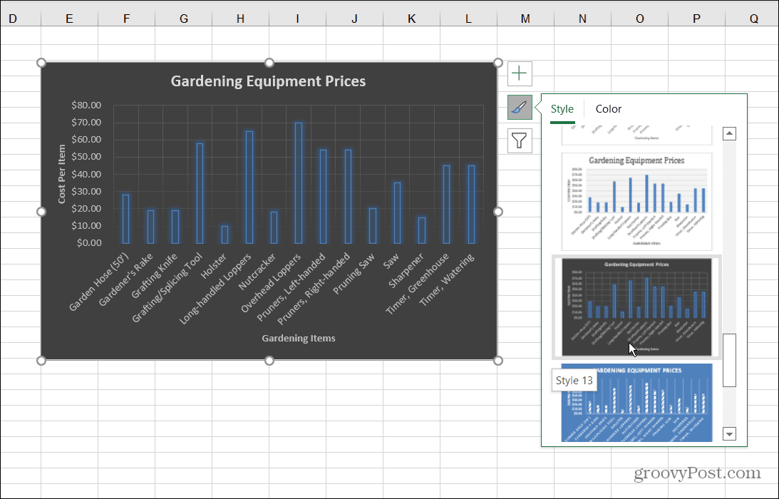
- Select your bar chart and click the Chart Style icon – it looks like a paintbrush.
- A menu comes up that allows you to choose a different cosmetic style for the graph. Scroll through and hover your mouse over a style to preview how it will look.
- You can also view the same style under the Design tab and Chart Styles section of the ribbon.
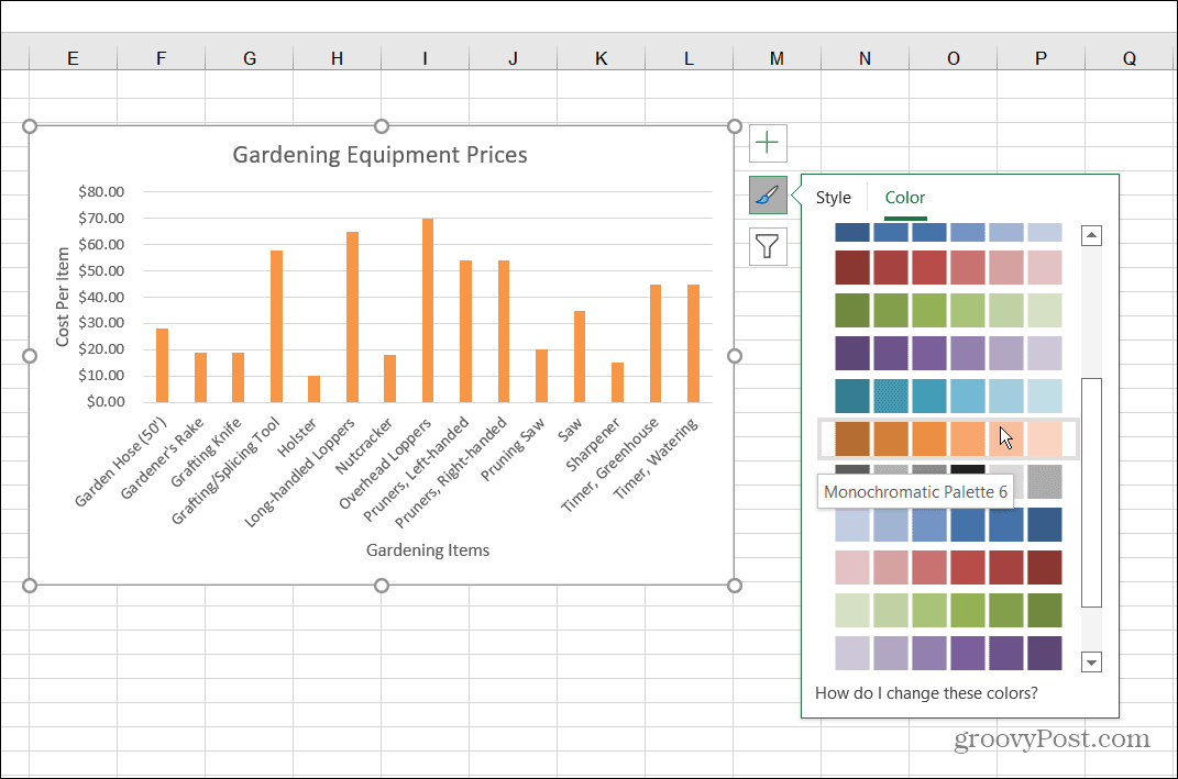
4. To change up the colors of the bar chart, click the Chart Style icon and select Color at the top. The color options are grouped into different palettes. Scroll through and hover the mouse over the palette to see a preview of how it will look.
Bar Chart Formatting
To further customize your chart, you can use some often forgotten about formatting options:
- Right-click the chart and click Format Chart Area from the menu.
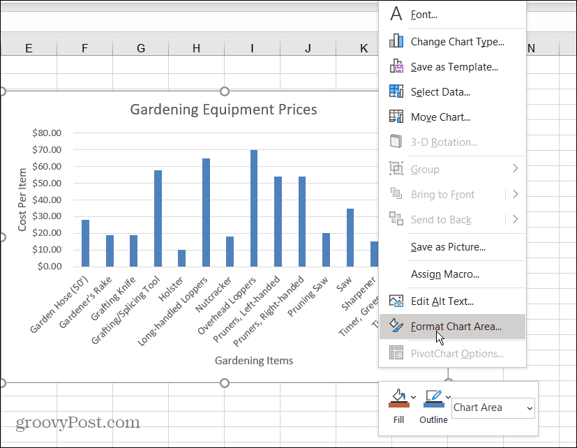
- A Format Chart Area menu will appear on the right side in Excel. You can change the border, fill, text options, and more from here.
Creating Graphs in Excel
Visually representing data by creating a bar graph in Excel is straightforward. A bar graph is clean and easy to read and manipulate. Excel also provides some excellent customization tools so you can make it even more visually appealing.
Now that you have the basics of creating a bar graph, you might be interested in creating more complex charts and graphs in Excel.
For more, look at creating a Gantt Chart in Excel. Something else you might be interested in doing is creating a Sparklines Mini Chart.